Summary Statistics
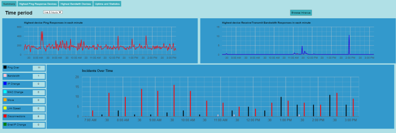
The Dashboard Summary section has 3 Graphs. The devices that are used in collecting data are defined by the Critical Device Selection

The top two graphs show the highest value for each minute for the worst case Ping Response, Receive Bandwidth Response, and Transmit Bandwidth Response. A different device may be the source in each minute.
TheHighest Ping Response Devices and Highest Bandwidth Devices show which devices were the cause of spikes at any particular time.
The lower half of the Summary page consists of a bar graph showing the number of incidents by time that occurred during the selected time period. Within each time a different bar shows the count of incidents by color coded type. The color of the bars match the colors of the statistics on the left.
On the left side is a list of the different types of events monitored by WBC Network Health Monitor which caused the incidents and the number of different devices having the incidents in the bar graph is shown to their right. Which specific devices caused these issues can be seen in the Uptime and Statistics
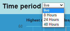
By default the data displayed on this page is live and updated every minute. There is also a drop down list that allows the display of 8, 24, and 48 hours of data.

